Abstract amounts hide their physical scale. I wanted people to see what money actually looks like.
I co-founded the product and built its currency data, 3D rendering, web experience, extension, and mobile port.
A live web app supporting 82 currencies and seven languages, a browser extension, and a mobile app in release QA.
Nobody has an intuition for large amounts of money. You know what a hundred dollars looks like; you have no idea what a hundred million looks like, and neither did I. Money Visualiser exists to fix that: type an amount, pick a currency, and it renders the actual stacks — real bill dimensions, real denominations, strapped and bricked the way banks actually bundle cash — in a 3D scene you can walk around. A human figure stands next to the pile for scale. The moment that sold me on building it was seeing that a middle-class lifetime of earnings fits on a single pallet.
The first commit landed on 13 January 2026 and the web version at moneyvisualiser.com came together in a three-month sprint. Then the same idea started leaking into other surfaces: a Chrome extension that meets you where prices already are, and a native mobile app that had to reproduce the whole 3D pipeline on a phone GPU. Three repositories, 1,532 commits between them as of mid-August 2026, all of it one person.
The concept is a toy. The implementation is three genuinely different engineering problems wearing the same brand:
For a stack to mean anything, the bills have to be right. The catalog models 82 fiat currencies with each note's real length, width, thickness and denomination set, plus precious metals as ingots and a large crypto catalog, organised into straps of 100, bricks of 1,000 and bigger bundles the way banks actually do it. Getting that data assembled and keeping it consistent was slower than any of the rendering work, and it became the most valuable asset in the project — which is exactly why the mobile app later generates its catalog from the web repo instead of maintaining its own copy.
A billion dollars in hundreds is ten million bills. You cannot draw ten million meshes in a browser, so everything renders as instanced straps — about a hundred bills per strap — with caps around 1,000 straps on WebGL and 5,000 on the opt-in WebGPU path. Above that, the scene switches representation rather than lying: towers and aggregate tiers take over. Live rates come through a five-layer fallback chain (edge cache, ECB, Frankfurter, Twelve Data, static snapshot), because a visualiser that dies when a rate API hiccups is a visualiser nobody trusts.
The web app runs Next.js on Cloudflare Workers with R2 and D1 behind it. The extension is a Vite build with content scripts and a service worker. The app is Expo/React Native drawing through expo-gl and Skia. Almost no rendering code is shared — what is shared is the data and the behaviour: the mobile repo generates its asset catalog from the website's source files and runs parity tests against it, so a bill dimension fixed once is fixed everywhere. That decision, made when the app port started, is the reason three codebases have not drifted into three products.
The commit history tells it more honestly than a roadmap would:
765 commits in three months: catalog, 3D scene, six environments from gold vault to aircraft carrier, comparison mode with shareable URL state, historical charts, seven interface languages, a D1-backed blog, and the move onto Cloudflare Workers. By late March the site did what the idea promised. April and May show 7 and 0 web commits — partly exhaustion, partly the correct realisation that the next win was not another web feature.
The extension repo is 19 commits and about 9,400 lines, and that smallness is deliberate. It does not re-render 3D in a popup; it detects prices on the pages you already read and hands off to the site with the right parameters. Version 1.3.0, in one focused day in July, added a Google Search widget: search a currency conversion, get an inline card and a one-click jump into a full comparison scene. Distribution surface, not a second engine.
The app repo's first commit is 2 May 2026 — then one commit sits alone for two months. In July the real port happened: 516 commits in a month, rebuilding the website's scene maths as a shared visual core, porting all six environments to expo-gl with Skia-drawn textures, and gating every step behind screenshot parity against the website. August has been release QA — device evidence, Maestro flows, store checklists. It is a 1.0.0 approaching the stores, not in them, and I would rather say that plainly.
About 199,000 lines of TypeScript across the three source trees: roughly 135,000 web, 55,000 mobile, 9,000 extension. The web app is live at moneyvisualiser.com in seven languages. The extension is at 1.3.0 with price detection and the search widget. The app has all six environments rendering natively and is grinding through release checklists. None of these numbers are usage metrics, because I am not going to dress repo statistics up as users.
"The monthly commit chart below is the most honest artefact on this page. It shows a product built in bursts: a three-month web sprint, a near-silent spring, and a July where the mobile port outproduced the original sprint's best month. Solo products do not progress linearly, and I have stopped pretending mine do. The gaps are where the thinking happened."
Everything below is read directly from the three local git repositories and their source trees on 13 August 2026. Commit counts come from git log; line counts exclude node_modules and build output; the August bucket only covers the first thirteen days of the month.
865 web, 648 mobile, 19 extension — January to August 2026.
Web, Chrome extension and mobile app all read the same asset data.
Each with real bill dimensions and denominations, plus metals and crypto.
English, German, Spanish, French, Japanese, Turkish, Chinese.
Read from the three local git repositories and their source trees on 2026-08-13.
Three repositories, one person, eight months. The commit totals are not effort-adjusted — a docs commit counts the same as a week of scene maths — but across 1,532 of them the shape is real: the web repo carries the product, the app repo carries the port, and the extension stays small on purpose.
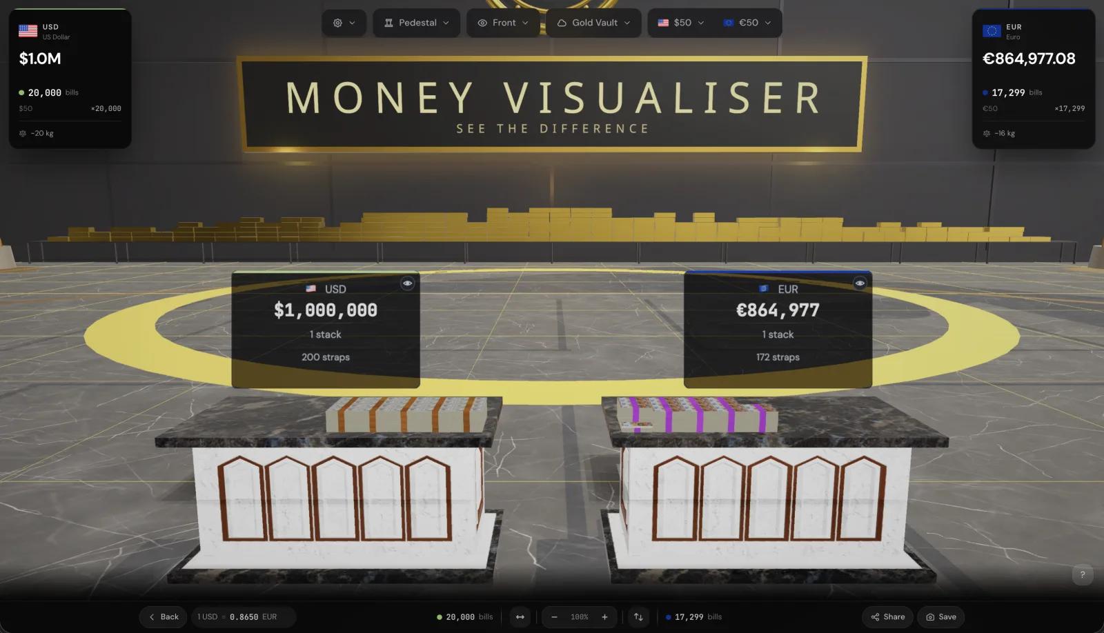 Compare mode in the Gold Vault environment: $1,000,000 in $50 bills against its euro equivalent — 200 straps versus 172, weight included
Two things in that chart are worth saying out loud. The April–May trough is not a mystery: the web version had reached the point where the idea worked, and the honest next move was deciding where it should exist next rather than adding features. And the July spike is what a planned port looks like when the groundwork holds — the parity harness was set up in the first days of July, and everything after that was execution against it.
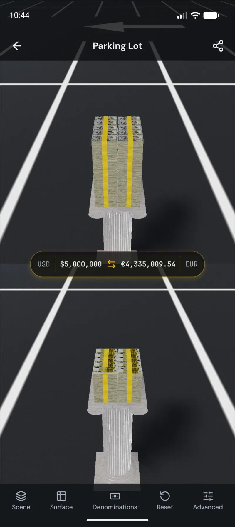 The same compare mode running natively on Android: $5,000,000 against its euro equivalent on live rates, dollar and euro notes rendered with their own dimensions
Line counts measure size, not value — the most important file in the whole system is the currency catalog, and it is a fraction of those lines. But the split is a fair picture of the strategy: one heavy centre, one faithful port, one thin wedge.
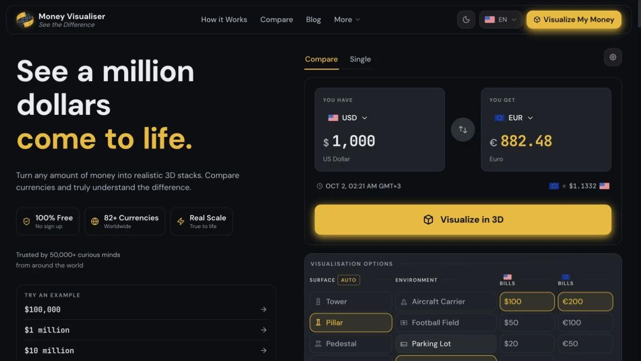
The web app is the product: the 3D scene with six environments, single and compare modes with shareable URL state, historical rate charts, an embeddable widget, standalone tool pages and a blog, in seven languages, running on Cloudflare Workers with a separate worker for market data. The five-tier rate fallback means the scene renders even when half the rate providers are down.
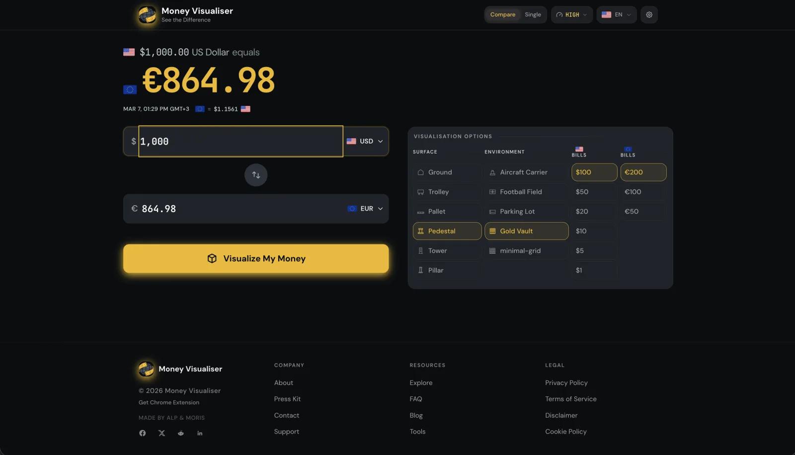 The web app's input screen: amount, currency pair, and the visualisation panel with surfaces, environments and per-currency denominations
The extension is distribution. It watches for prices in the pages you already read — including an inline widget on Google currency searches as of 1.3.0 — and turns them into one-click jumps into the visualiser with the comparison pre-configured. Nineteen commits, because its job is to be small.
The mobile app is the bet that this belongs in your pocket. It reproduces the scene natively — expo-gl, Skia textures, instanced rendering, all six environments — against screenshot parity with the website, and generates its entire asset catalog from the web repo's source so the two can never disagree about a bill's dimensions. As of mid-August 2026 it is in release QA, not in the stores, and this page will be updated when that changes.
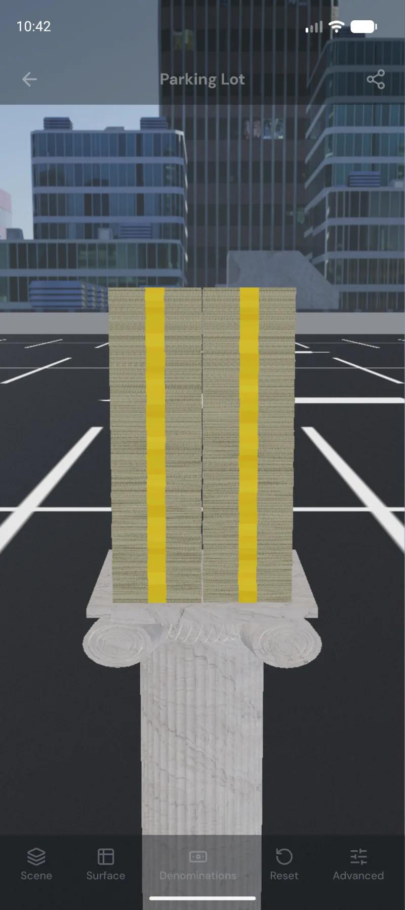 $5,000,000 in strapped bills on a pedestal in the Parking Lot environment, city skyline behind it — the same scene the website renders, drawn on a phone GPU
Past a certain size the scenic environments stop being an option: the app locks to Minimal Grid and says so, because a parking lot full of pallets is neither renderable nor readable. It is the same instinct as the strap caps on the web — decide what the scene degrades into before the GPU decides for you.
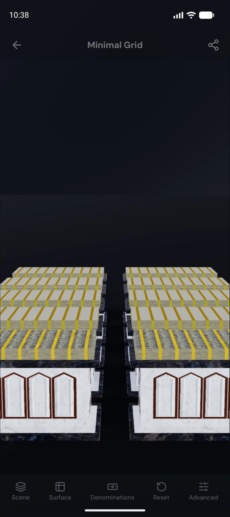 $500,000,000 rendered as bricked pallets on the Minimal Grid, the fallback the app locks to for very large amounts
The 3D rendering is the demo, but the thing that took longest and matters most is the asset catalog: 82 currencies with real physical dimensions, denominations, metals and crypto, all consistent with each other. Rendering code gets rewritten per platform; the catalog gets generated from one source. If I lost every renderer tomorrow I could rebuild them. Rebuilding the catalog would be the real cost.
The extension works because it refuses to be a second product. Nineteen commits bought a presence in search results and on shopping pages, because it delegates everything hard to the site. The mobile app is the opposite bet — a full native port — and it cost 648 commits and is still not shipped. Both were right for what they are, but the ratio is a lesson I will carry: meet users where they are cheaply before rebuilding the engine for a new platform.
The mobile rebuild only worked because every step was measured against the website: a generated catalog with parity tests, and screenshot baselines for every environment and money tier. Without that harness, a solo port of a 3D pipeline to a different GL stack would have drifted into a lookalike. With it, 516 commits landed in a month without the two products disagreeing about what a million dollars looks like.
Money Visualiser is one idea — make amounts of money physically legible — carried across three platforms in eight months: a web app built in a 765-commit sprint on Next.js and Cloudflare, a deliberately tiny Chrome extension that turns search results and price tags into entry points, and a native mobile port that reproduces the whole 3D pipeline against parity tests, now in release QA.
The pattern I would defend from all of it: put the irreplaceable work in data, not code, and let every new platform generate from it. The renderers are all different. The money is the same everywhere — which, for this product, is the entire point.
 Alp Yalay